Photo Session Colors In Silver Spring, Maryland
Ok, so you booked a photographer. Congrats! What are the photo session colors going to be? Hopefully your photographer will be able to help you, if not maybe this blog will give you some tips!
First thing to think about is what kind of session are you doing? Is it outdoors? If yes, what season is it? Is it an indoor session? If yes, what is your focus? Is it a family session? Is it a milestone session? These are just a few question to answer before we can start planning your photo session colors.
With any and all sessions there are a few key components to keep in mind when planning your photo session colors. Number one: Stick to a color palette. Number two: add texture. And finally number three: mix up solids and patterns.
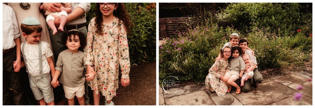
Let’s expand on all these points. Number One: Stick to a color palette. Pick one or two main photo session colors and then add in a little pop of color. For example if you were doing an outdoor family session in Silver Spring, you might pull inspiration from the following images. Mom chose cream and mint as her main colors and then added coral in as the pop of color.
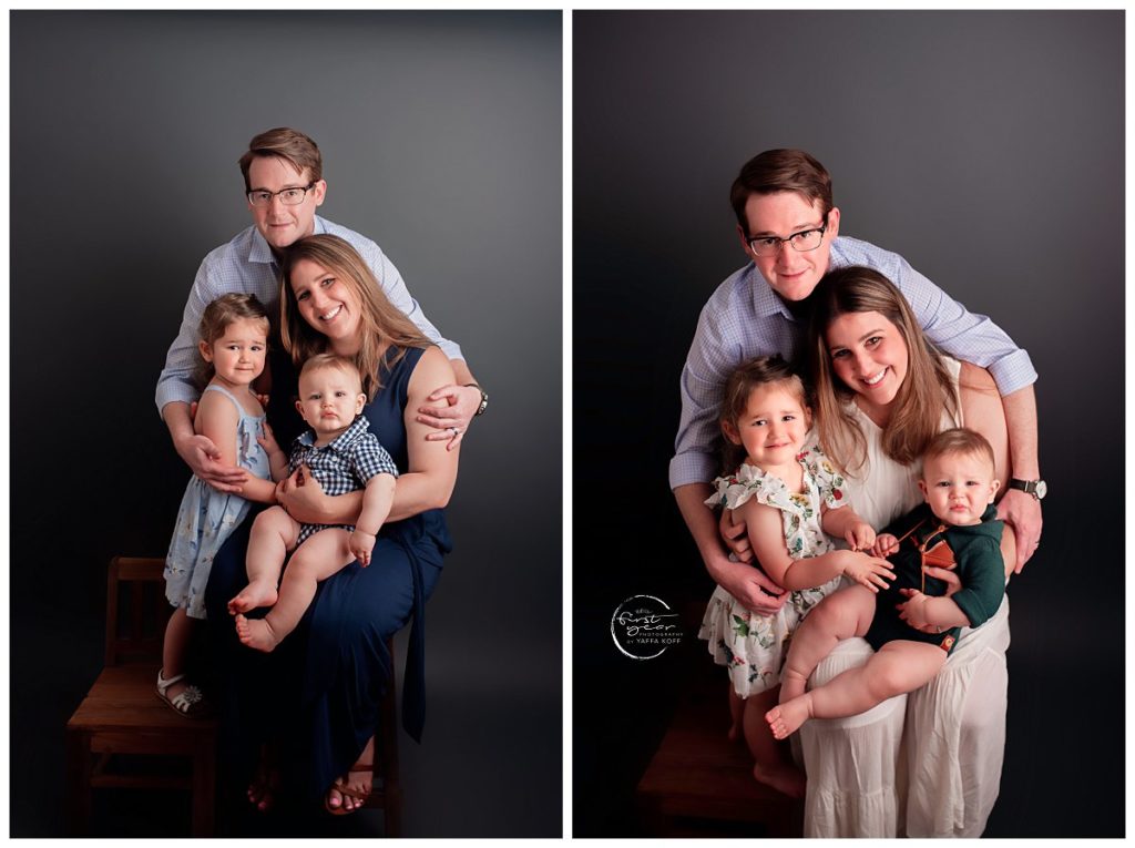
If you were doing an indoor family session you might have a little more flexibility and be able to choose multiple photo session colors. The following images were taken in one session but because it was in studio we had an easy time doing a quick clothing change. Mom chose blues as her first color and I love that she layered different shades to give dimension. The second color was green and white and the floral dress was the pop of color.
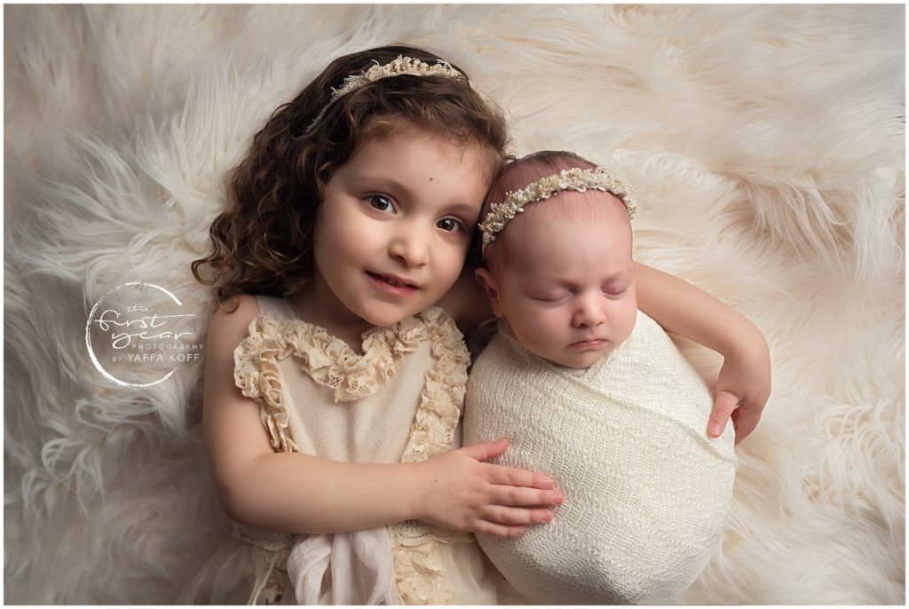
Number two: add texture. That can take the form of a sweater in an outdoor session or a lace top in an indoor session. Many of the cute outfits I have in my client closet have texture on them because it just adds so much dimension to the images. Whether it’s a cute leather pocket detail or 3D flowers on a dress, all of these just make the image a little bit richer. This adorable image is all monochrome so al the focus is on their cute faces, but the texture on both of the girls adds so much depth to the image.
Jewelry is a good way for mom to add texture as well, as long as it’s not too distracting. For newborn sessions I always encourage basic black or white tees but for a family session dad can add texture with a button down shirt. Have a little girl? Put something pretty in her hair! There are so many ways to add texture no matter the location or season. If you’re not sure, I’m happy to help!
Number three: mix up solids and patterns. So this one is one of my favorites! It’s important to find a good balance when choosing solids and patterns in your photo session colors. If everyone is wearing a solid color it can get boring really really fast. If everyone is wearing patterns it can be so busy your eye doesn’t have anywhere to rest!
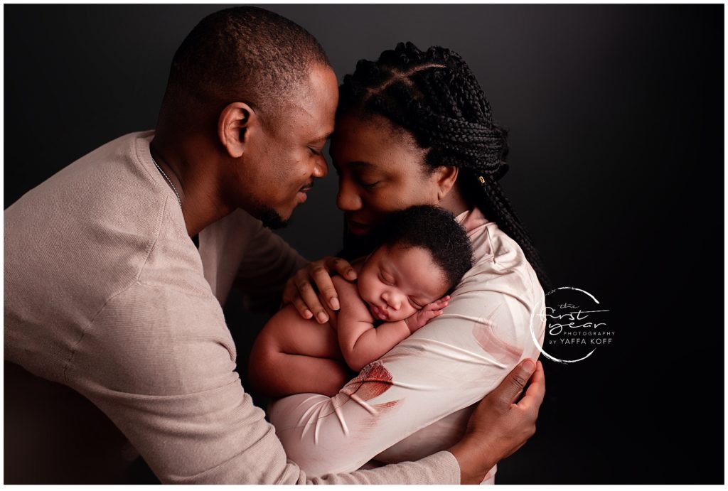
A good plan is always to have more solid then pattern and make sure that your different patterns go together but don’t match. “Matchy Patchy” is cute in real life, but in photos it gets lost. You want each child to shine on their own and not be glossed over. The one exception to that rule is if you’re doing a mommy and me glamour portrait, sometimes the mom and daughter puffy dresses can be really gorgeous. For example the image below. The pattern on moms dress is balanced really well with the solid sweater dad is wearing.
I’ve tried to give a few examples of all these three ideas when planning your photo session colors, but if you need more assistance I am more then happy to help! The good news is I have so many options in my client closet and I am constantly expanding, so you have may options to choose from. I also love shopping so I’m more then happy to find links online for you!


